#006 Let's Graph Some Dental Production Numbers
Putting Production in Context On a Dental Dashboard
This week, I am consolidating a bunch of dental practice numbers into a dashboard that enables team members, office managers and owners to be able to put a finger on the pulse of their business. We will be studying real data from a startup dental practice.
The low-hanging fruit on here is financial. The data is easy to source, and we only have to make a couple of decisions before we can start. For example, we will be using “charge amount” as our stand-in for “production”. We will tackle the more complex stuff once we have finances down.
Today, we are going to focus on a single graph: total practice production with month-over-month and year-over-year comparisons. I’m going to include an analysis of why I designed the graph, how it answers stakeholder questions, and I’ll show you the pencil-on-paper strategy I used to create it. I’ll also give you a copy of the cleaned data.
What timeframes can we use to put our numbers into context?
The standards that come to mind here are: the day, the week, the month, and the year. All of these serve various purposes. Since dental offices usually have a monthly staff meeting, the month is a pretty reliable indicator.
The trouble we have with the “month timeframe” is that a month is a long time to wait for numbers. Let’s say I have questions about how the business is doing on June 15th. I can’t get the answers now. I have to wait until July 1st, and then crunch the numbers and graph them, before getting an answer.
On the flip side, doing this daily or even weekly is a bit too frequent. There are going to be good and bad days, good and bad weeks. By zooming in that close, we lose context. It’s sort of like missing the forest for the trees. (Oh, and also, looking at numbers every day will drive you bonkers.)
Is there a solution in-between? I’m going to model my numbers on a rolling 30 days.
Imagine getting an email in your inbox every Monday morning at 7:30 am, at the beginning of the work day, summarizing how the past 30 days have gone. It would give you insight into how the last week and month went, and inform your decisions for this week. It seems like a good way to keep an eye on trends.
What are the research questions around finance?
Team members want to know that they are contributing to the success of the people around them. We all have an innate drive to collaborate and cooperate with the people around us. We want to feel valued, and to know that we are doing good work. Some team member questions are: Am I busy? Am I productive? How is the quality of the care I am providing? Am I meeting goal? Am I contributing to my team? Is my team contributing to the practice? Are we doing better than last month? Are we doing better than last year?
The office manager and principal dentist also care deeply about how well they are taking care of their patients. On the financial side, the big questions are, are our people busy? Are they productive? As a practice, are we profitable? If not, then why? If yes, then why? People are looking for raises. Can we afford them? Are we doing better than last month? Are we doing better than last year?
You can see an certain amount of overlap between what team members are wondering and what management people are wondering.
What does a production graph look like for the practice?
On this note, we are now ready to tackle the graph itself. I’m going to start with the end result and work backwards.
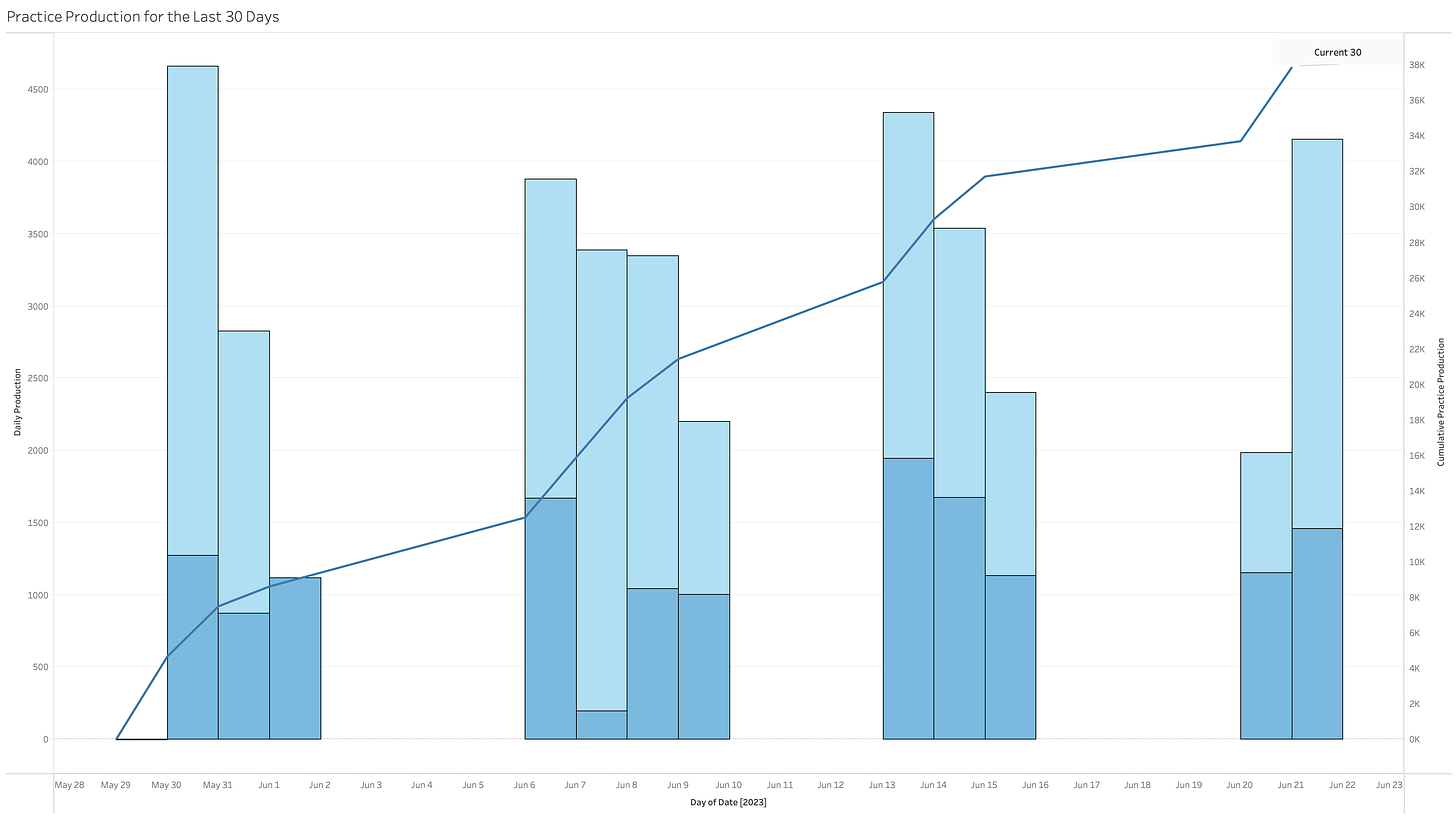
This is close to the final graph that I want.
The graph was done on July 24th, using data from the previous 30 days.
It breaks down total production for the day (each individual bar), and divides it further into the type of production (restorative in light blue and hygiene in dark blue).
The scale for the bars is on the left (the highest day is just over $4,000).
The trend line going through the middle is the total cumulative production for the 30 days (I’ve labeled it “Current 30”). It’s scale is on the right—you can see at a glance that the practice earned about $38k in that timeframe.
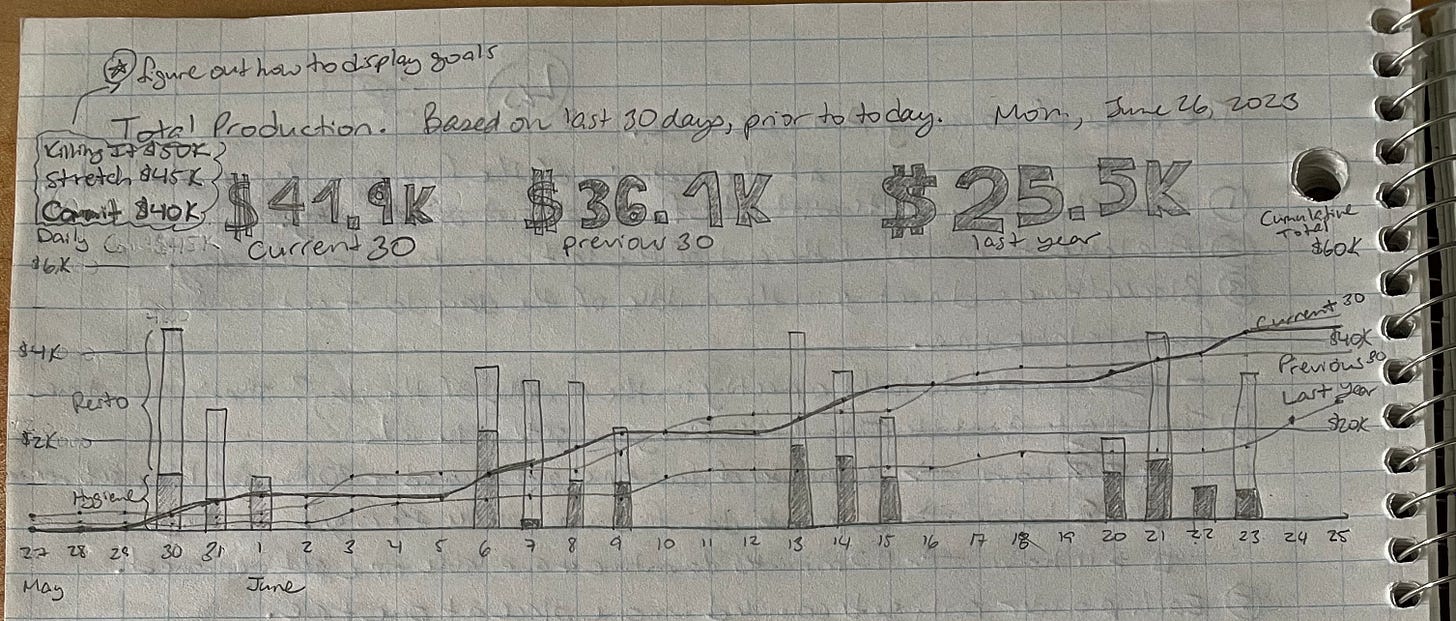
Now, we are going to take one step back to see how I got here. Getting this automated in data analysis software is going to take a bit of work. I like to start with a pencil-on-paper sketch of what I’m aiming for.

This graph goes on the practice-level dashboard1. In my sketch, I have included two more trend lines:
one for the Previous 30 Days, which show me a month-over-month view; and
another for Last Year 30 Days, which shows year-over-year.
These answer the questions:
Are we doing better than last month?
Are we doing better than last year?
One of the questions I had while making this graph was, How do I generate the right dates in the past? The easiest solution I found was to subtract 30 from the current_date to get the prev_30_date, and 365 from the current_date to get the last_year_date. This avoids issues around longer vs shorter months, as well as around leap years. For example, I might have a February 29th last year (but not this year), or vice-versa.
Here is a picture of the first few lines of the data I used, as well as a copy of the cleaned data, so you can play with it yourself.
I’ve omitted a bunch of the pencil-on-paper work I’ve done for this. My hope is that the “clean” versions are easier to understand. I learned a lot by graphing everything by hand though. I know exactly which fields I need to pull. I know how to generate my historic dates. And, now that I can see the graph, I can see that it will be helpful for the team working in the practice. And ultimately, that’s what I really care about.
The next step is to look at the cumulative totals for each of these periods, and to display them to stakeholders in the context of the practice’s goals. We will be looking at this next week.
In the next weeks, we will drill down into the numbers, for each department and team member. For example, a dental hygienist might care about their own individual graph, and maybe some comparison to how they are doing with regard to other hygienists, but they might not care about having this full practice-level production graph.


